When evaluating the best-designed real estate websites, several factors come into play: visual appeal, user experience, functionality, and how well they showcase properties. Here are some of the top examples of real estate websites renowned for their exceptional design and user experience:

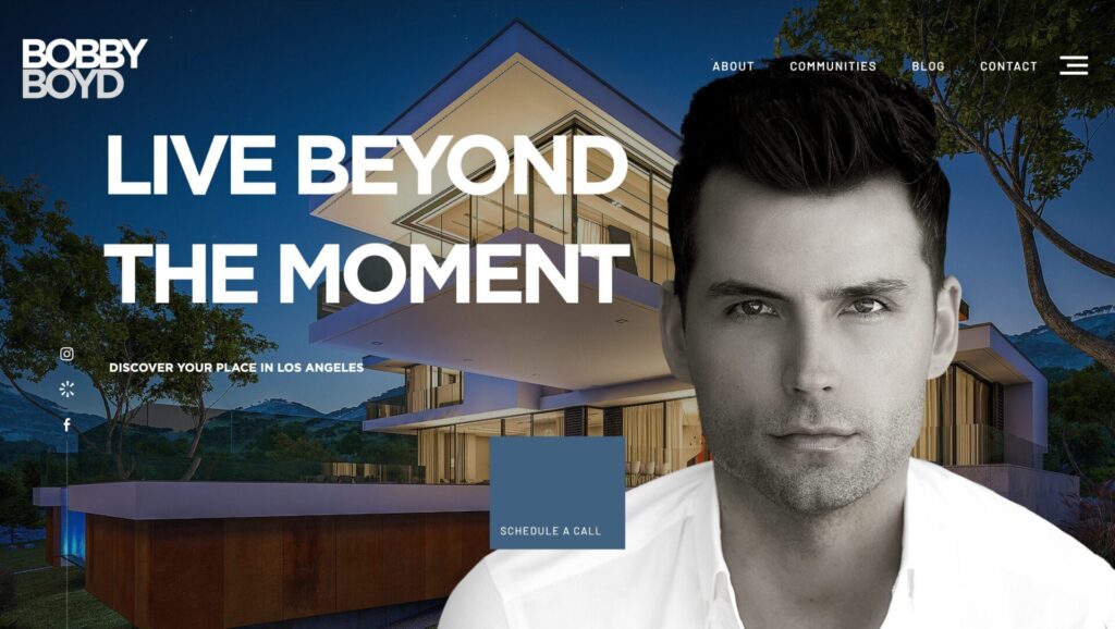
www.bobbyboydre.com
Bobby Boyd’s website stands out with its sophisticated and modern design, reflecting a high-end real estate brand. It features a visually appealing layout with large, high-resolution images and a refined color palette that exudes luxury. The user-friendly navigation includes an intuitive search function, detailed property listings with virtual tours, and interactive maps, enhancing the browsing experience. The site is fully responsive, ensuring seamless access across devices, and effectively showcases agent profiles, client testimonials, and valuable market insights. Prominent calls-to-action and easy-to-find contact information further streamline user interactions, making it an exemplary model of luxury real estate website design.

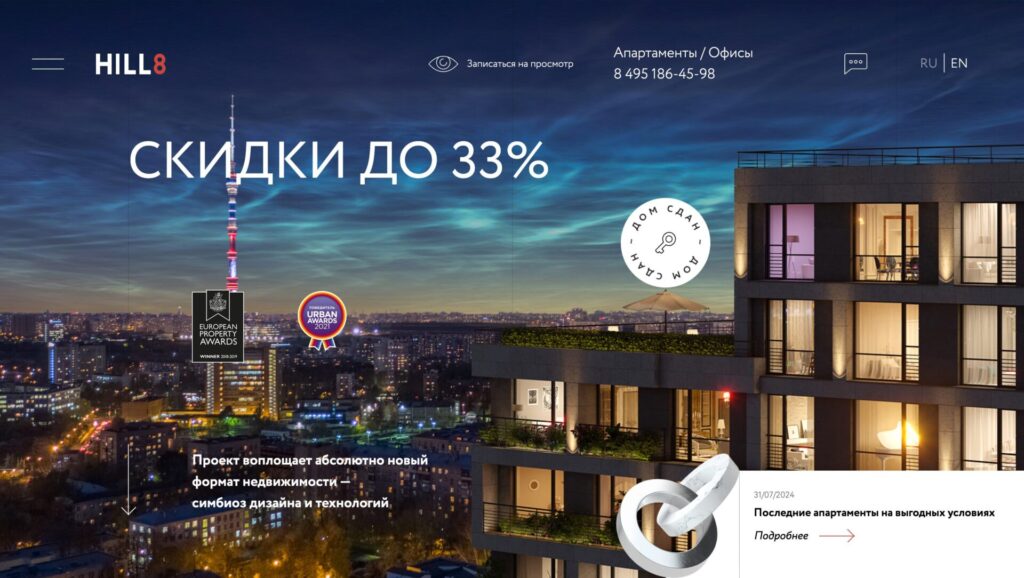
hill8.ru
The website Hill8 features a sleek and contemporary design that emphasizes simplicity and elegance. It utilizes a minimalist aesthetic with a clean layout, ample white space, and a sophisticated color scheme to enhance visual appeal. High-quality images and modern typography contribute to a refined look, while an intuitive navigation system ensures easy access to key information. The site effectively highlights its offerings with detailed property showcases, interactive elements, and clear calls-to-action, all optimized for a seamless experience across various devices. This design approach not only reflects a premium brand identity but also facilitates a smooth user journey.

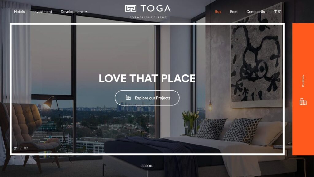
www.toga.com.au
The website TOGA features a modern and visually striking design that underscores the company’s focus on premium hospitality and real estate experiences. It boasts a clean, professional layout with a refined color palette and high-resolution imagery that highlights their properties and services effectively. The site’s user-friendly navigation includes intuitive menu options and clear calls-to-action, facilitating easy access to key information and property details. Responsive design ensures optimal performance across all devices, while interactive elements and well-organized content enhance user engagement and accessibility. Overall, the design successfully communicates the brand’s upscale image and commitment to quality.

www.cibcsquare.com
The website CIBC Square features a sophisticated and dynamic design that highlights the grandeur and functionality of the CIBC Square development. The site boasts a modern, clean layout with a strong emphasis on high-quality imagery and a refined color palette that reflects the building’s sleek architecture. Interactive elements, such as detailed floor plans and virtual tours, enhance user engagement and provide comprehensive insights into the property. The intuitive navigation ensures effortless access to key information, while the responsive design ensures optimal performance across devices. Overall, CibcSquare.com effectively combines visual appeal with practical functionality, showcasing its premium real estate offering with elegance and clarity.
